Case Study: Trade PMR | December Labs

December Labs is now Qubika. For more information, visit our new website

Case Study

TradePMR

UX/UI for B2B Trade Service Platform

Screens
  • Client

    TradePMR provides financial B2B services to independent registered investment advisors (RIAs). The centerpiece of EarnWise, their advisor workstation and cloud-based mobile solution for technology, brokerage, and custodial support, was a sophisticated but still too complex WebApp platform, lacking a clear hierarchical structure and thus, intuitive user experience. TradePMR approached December Labs for a complete makeover of EarnWise, adding a strong UX/UI focus and providing its clients with a gratifying mobile-responsive experience.

  • Challenge

    Though at December Labs, we had successfully catered several clients within the finance space over the years, this projects’ success depended on us truly understanding the specifics of TradePMR’s complex area of business - the trade sector.

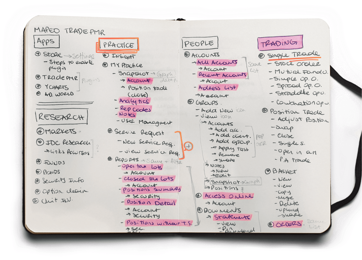
    Our team of UX/UI experts started out by studying all flow charts, dashboards and information to be displayed or used within the platform, but most importantly, we studied the trade market, how it works and what takeaways could be leveraged for an optimized customer journey. We left no stone unturned and went through a in-depth on-boarding period with our client before the project officially kicked-off.

define problem
define user
redefine problem

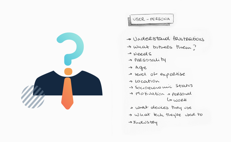
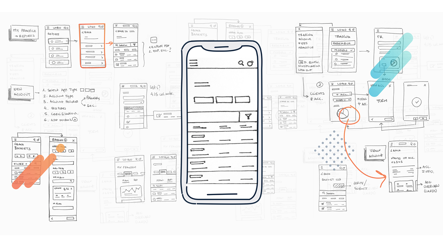
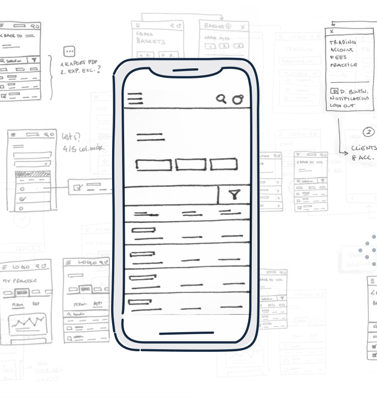
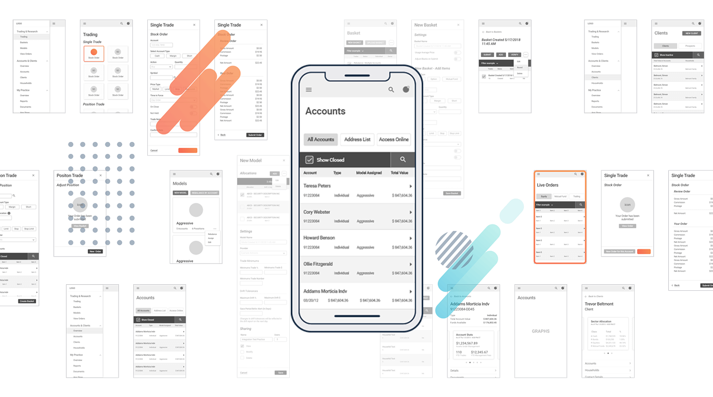
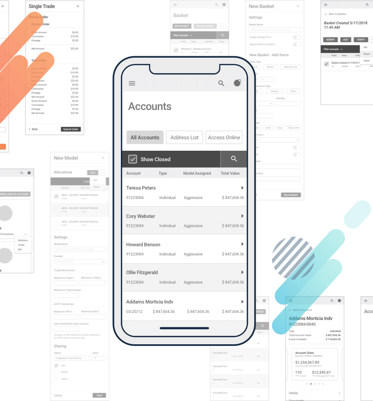
To truly understand the various user-journey challenges, the December Labs UX/UI team initiated the project by defining an EarnWise user prototype. Through hypothetical problems and solutions we concluded different path scenarios throughout the WebApp and started an optimized and efficient wireframing process based on our thorough analysis.

Problem

think. arrange. simplify

Think
Notebook
Video
Wireframe Wireframe
Wireframe Wireframe
Video
trading has never been easier

UI

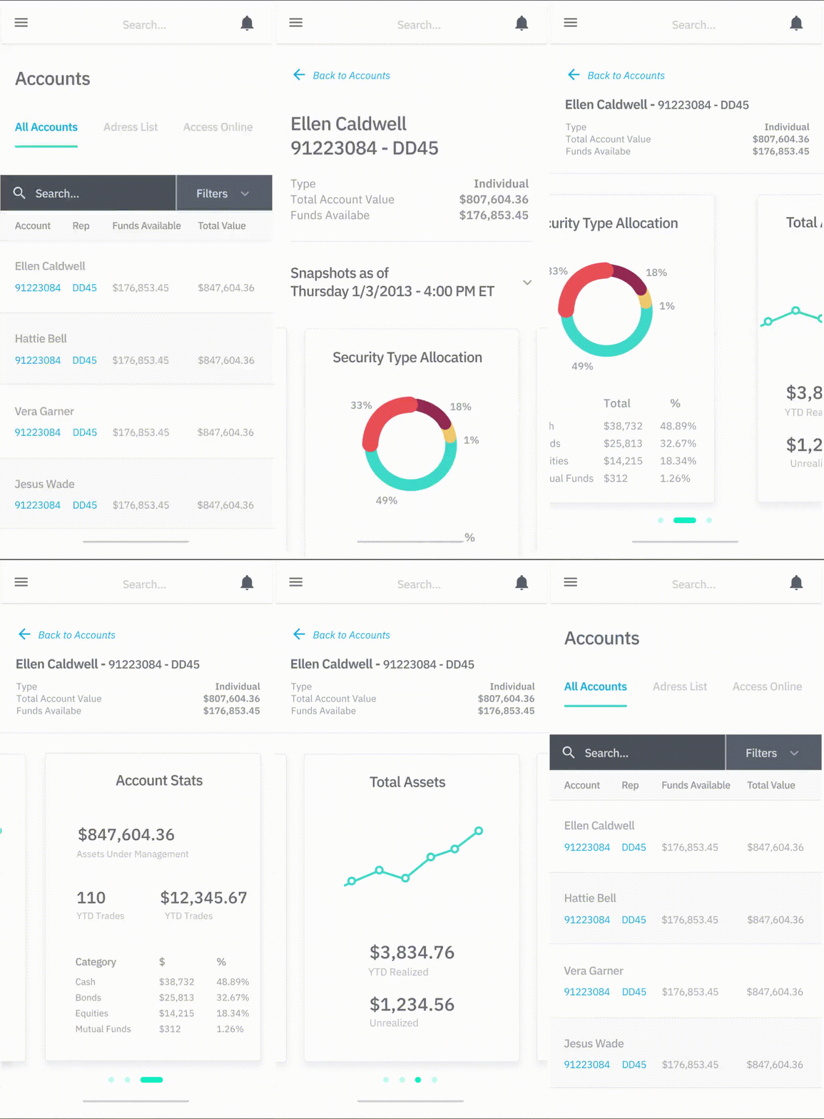
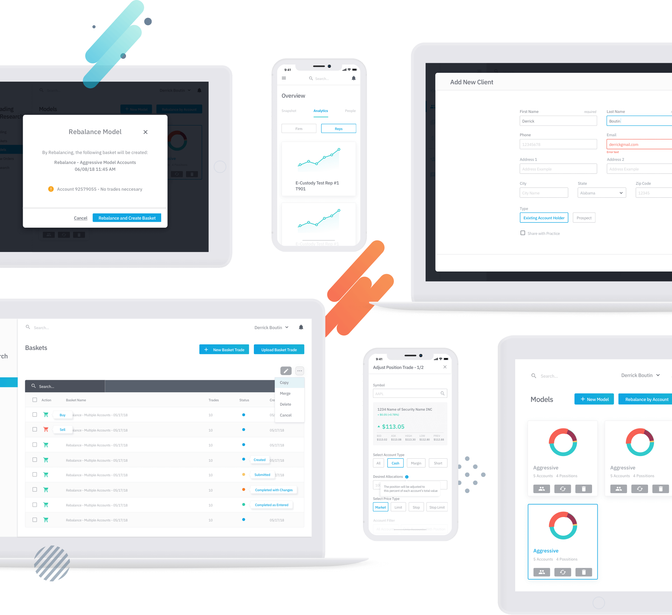
Due to the complexity and amount of information to be displayed, the UI phase was centered around creating a clean design, visually easy to process, and providing a very intuitive structure, making it effortless for the user to understand and navigate the WebApp. In addition, we optimized the products’ brand colors towards an harmonic and contrastful while still sophisticated palette.

Colours Colours

trade is the act of

buying, selling, or exchanging stocks, bonds or currency.

Desktop Desktop

We opted for a straightforward font type with good readability on large and small screen sizes as well as desktop and mobile devices.

Devices Devices
Quote

“December Labs provided high-quality design work, and they delivered exactly on time. They estimated the work would take eight weeks, and they weren’t a day late. They were very easy to work with; any feedback we provided was incorporated well, and they understood where we were coming from.”

Christine Young
Christine Young Director of Business Strategy

Read full review here

Clutch Logo

Let's work together

Ready to rocket-fuel your product? Get in touch with our growth strategists to vet your idea or product and discuss options for approach and solutions.

Get in touch

Newsletter Sign-Up

*Required fields

Get In Touch

*Required fields

For Job Opportunities, please click here

This form is protected by Google reCAPTCHA. Terms. - Privacy.