Which Are The Main Differences Between UI And UX?
This guide will help you understand how UX vs UI Design work together
Updated: Dec 20, 2021
Published on: Jan 27, 2021
UX and UI are both fundamental elements of design. But these two terms are often confused by people, sometimes using them interchangeably. Despite both sharing the U that stands for “User”, there’s more than one UI UX difference between both terms, since these designers encompass different aspects of the design and overall product development process.
It’s easy to understand why. First, UX and UI designers work closely together throughout the development of a digital product. In some cases, the same person takes on both roles. Also, UX and UI designers share a common goal: to increase user satisfaction.
However, they are indeed two different roles. Though they share a common goal, UX and UI teams focus on different aspects of design to achieve that goal.
This guide will help you to gain an in-depth understanding of each discipline, how they differ, and how they come together to help deliver a successful product. Along with this, it will also provide you with a brief look into the history of user interfaces, to allow you to get a better understanding of everything related with the world of UI.
What Is UI?
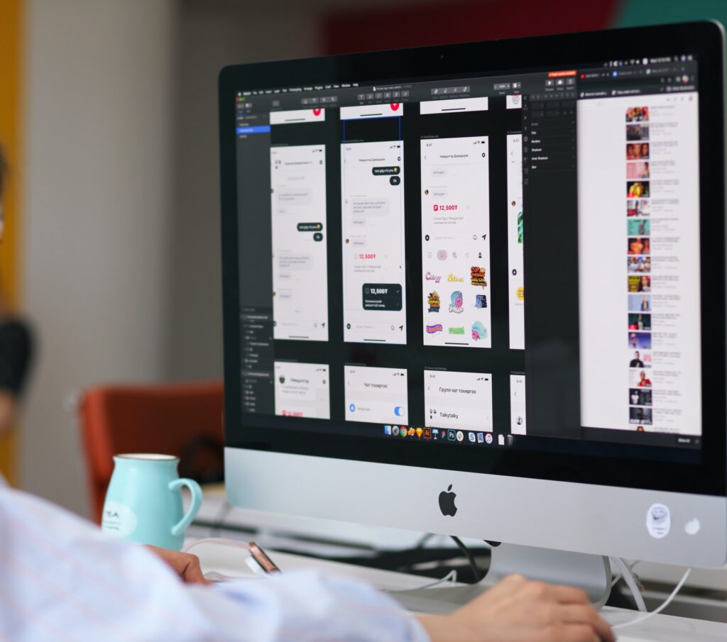
UI stands for user interface and concerns the aesthetics of a digital product, along with the interactivity behind those aesthetics. It involves aspects such as the graphical layout of the product and any visual elements, including typography, color schemes, button shapes, fonts, etc. The creation of a cohesive UI design includes visually-stimulating and themed appropriate designs that match the app, website or platform’s style and personality. In order to do so, UI Designers are the ones concerned with product aesthetics, and it’s up to them to make sure that every single detail and element harmoniously coexists with one another, all while serving a specific purpose. Their work is as important as all stages of product development, especially since they create the look and feel of the final product that users have to interact with.
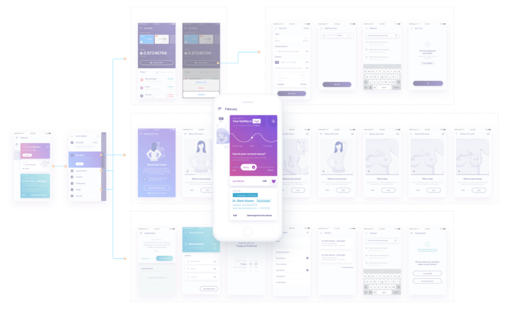
Here’s an example from the UI design style guide we created for the Celbrea breast health monitoring app:
Here you can see the color code and sets of icons we created for the user interface. Every design choice has meaning. In this case, the intention was to produce a relaxed and sympathetic feel as well as an attractive look.
UI design also includes animations, transitions, and interaction design, which is how interactions are represented visually.
The user interface is key as it has a huge impact on the user. Something as simple as the shape of a button or the appearance of an icon affects whether a user knows how to carry out their intended action.
As well as indicating actions and following flows, designs must, of course, be aesthetically pleasing to the user. But good UI design also goes beyond that.
UI designers must carefully consider the visuals they use and what they represent, then make sure those visuals are consistent throughout. This affects how easy it is to use or navigate a product. Interaction should be, above all, intuitive, and users need to easily navigate through your product without much trouble.
Plus, as you can see in the above example, UI design can even express the personality of the brand behind the product or the atmosphere they’re trying to produce. UI Designers are key contributors when it comes to enhancing a brands visual identity and helping in creating and transmitting to their users a full experience and imagery.
A brief history of user interfaces
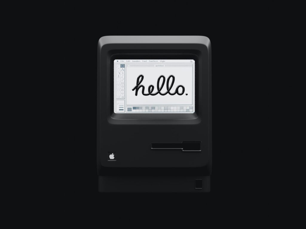
Back in the early 80’s when Apple launched its newest and most groundbreaking computer device, the Macintosh, the company was at a point where it appeared to be kicking off a design revolution in the personal computer sphere, by leading innovation in both their hardware and software. By introducing their newest graphical user interface and mouse, they kicked off a design revolution in personal computers, allowing for the creation of a new wave of computers that provided something never seen before: an user-centered and more understandable approach to their consumers, in both their physical design and software solutions. In doing so, Apple stepped in and contributed to the democratization of these new innovative devices, making them more available to a mass market that was ready, willing and eager to start using them. This first commercially popular optical mouse was called the Pro Mouse and was later on followed by the Mighty Mouse, which was an updated version of its predecessor that added touch and pressure sensitivity to the previous button-based hardware. The third development was called the Magic Mouse, which then allowed users to interact by using different combinations of fingers. Later on, in 2001 and with the release of its iPod music devices, the company also introduced another touch-based UI, its famous scroll wheel, another more complex and touch-sensitive interface.
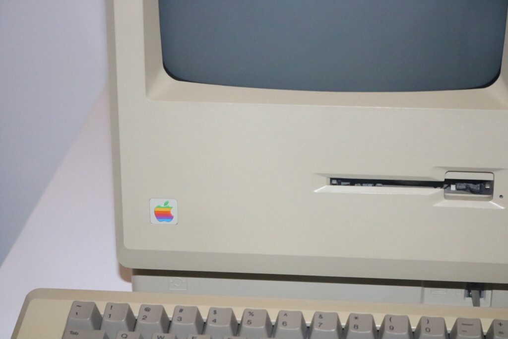
By 1988, the company had already sold 1 million Macintosh computers, and their competitors were also following their footsteps: IBM, Compaq and others were slowly introducing their own versions of the computer mice and imitating Apple’s user-friendly software. Along with these companies, Microsoft also followed this wave with the introduction of Windows 1.0 in 1985, but it wasn’t until the 3.1 version that launched in the early 90’s (1992), that the actual tailwind started between both tech giants.
Despite the implosion seen during the 80’s, the next decades weren’t witnesses of such impressive breakthroughs in regards to UI. During the 90’s to mid 2000’s, innovation in terms of user interfaces stalled. The race between Microsoft and Apple slowed down as the laptop started to overtake the popularity of the desktop computer. Jobs’s big Apple introduced trackpads and trackballs into their new Powerbook laptops, while competitors like IBM also branded their pointing sticks as “TrackPoint”, and integrated them into their new laptop devices.
As the 90’s went on, computers continued to downsize from the desktop to the portable PC, and a particular new small, light and portable device started to gain traction: the PalmPilot. This long predecessor of our smartphones introduced a new user interface, called the stylus, which worked with a touch screen and an alternative alphabet called “Graffiti”. Along with these new introductions, voice interaction software also began to gain popularity in the late nineties, when in 1997 Dragon (which was eventually acquired by Nuance in 2000 and renamed after the company) sold millions of copies of its voice interface software. Nevertheless, it wouldn’t be until today’s generation of voice assistants that voice would turn into such an important tool and form of computing interaction, with today’s strong usage of this technology thanks to the many “Hey Siri” and “Ok Google” we enunciate everyday.
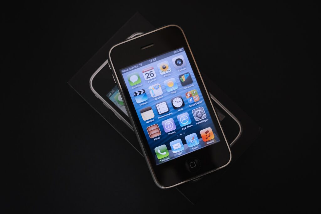
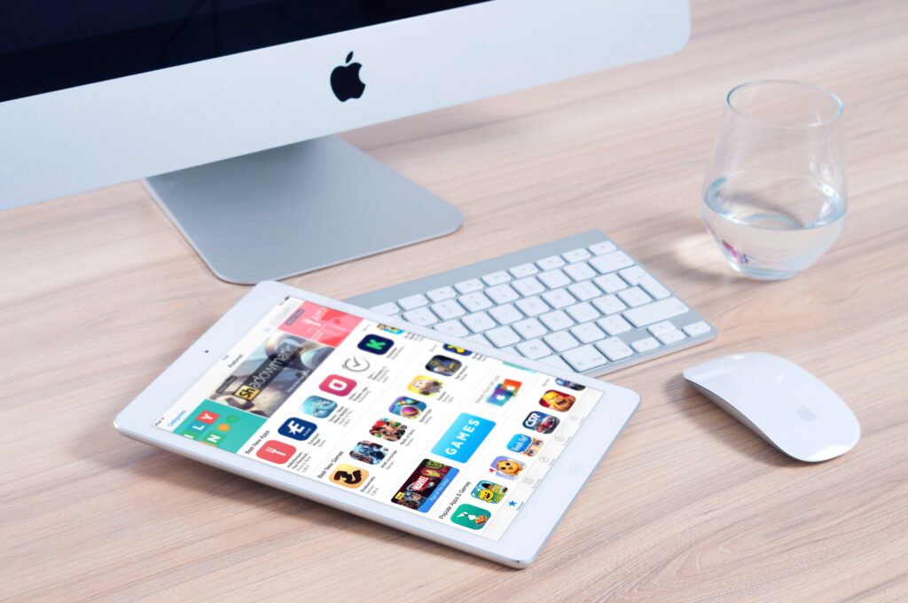
Regardless of the period that sat between the early 90’s to mid 2000s’ was characterized by a decline in innovation, we wouldn’t have to wait long until new inspiration arose. With the 2010s, a new period of disruption and breakthroughs began. This new decade was defined as the “UI Renaissance”, mainly because of the many powerfully disruptive forms of interaction that emerged during these years, and the advancements in the user-centered design of said interfaces. This big leap forward in UI design was a full circle moment for Apple since they again led this new wave with the introduction of the first iPhone in 2007 and the iPad in 2010.
Both of these devices were crème de la crème when it came to UI design in both their hardware and software, as well as encapsulating a design major and aesthetic that will reign for the next decades. Along with the latter, multipoint capacity touch was introduced in both devices, a new functionality that allowed users to interact with digital content in many new ways. Despite this technology wasn’t created by Apple -it was an original invention by a company called Fingerworks back in 2005- the tech giant was the one to democratize it, along with other smartphone and tablet manufacturers who also adapted several forms of touchscreen technology over the next couple of years.
Nowadays, we have entered a new wave of UI revolution, which is characterized by three main themes: users’ increased demands on app’s aesthetics and usability, the proliferation of touchscreen devices and the rise of voice assistants.
Incorporating UX/UI is becoming a main concern for companies of all sizes who want to create apps and platforms, not only because they want to engage their user base with their product, but mostly since they are dealing with consumers that are becoming more demanding, refined and meticulous with the apps they download on their phones. They no longer want products that don’t serve them a specific purpose that is tailored to their needs, don’t provide a well-defined service and, most importantly, that aren’t aesthetically pleasing. Users nowadays are accustomed to interacting with a higher level of UI that going back and settling for less is a no go. Besides, their daily increased usage of apps like Netflix and Facebook -who have invested millions of dollars in UI- sets the bar even higher for new companies who are eager to launch their software products or for those willing to work on and improve their existing ones.
A second remarkable theme of this new era has to do with how touch screens had not only become an ubiquitous part of how we interact with digital devices such as smartphones and tablets, but they’ve extended to other types of devices like kiosks, ATMs and appliances. Technology has turned virtually all appliances into smart things, thus allowing us to get more information on our daily usage.

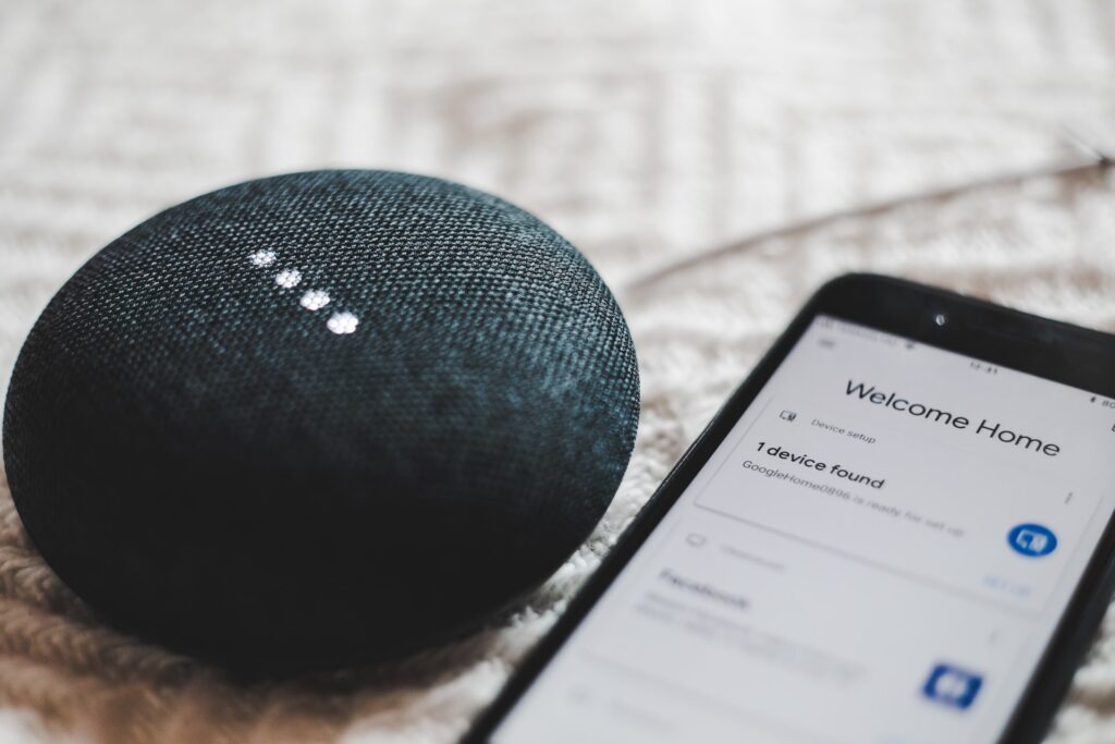
Together with this, we’re also currently witnessing a revitalization in the way we use voice assistants, with Apple’s Siri, Google Now (introduced in 2012) and Amazon’s Alexa in 2014. As well as providing a service, all these devices also sustain their content on the data that users contribute to these interfaces to fulfill their request. These immersive experiences enabled the generation of new virtual and augmented reality devices that added another dimension to user interfaces and interaction overall. These head-mounted devices allow users to interact with virtual objects in diverse settings, expanding to gaming, social networking and even architecture.
What does the future of UI look like?
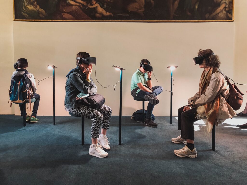
We are currently writing the history of how UI will continue to transform, advance and reemerge in the upcoming decades. With the proliferation of smartphones, touch screen devices and the newer technologies such as AR and VR, we will continue to witness devices and software applications and platforms that are more aligned with user’s needs than ever.
As previously described, the keyboards and mice introduced during the 80’s were successful baby steps that worked well for 30+ years in closing the gap between our real, spoken world, and the digital computing surfaces. They started the revolution and aided with the process of creating a reality that headed towards the organic forms of interactivity we are experiencing in the multiple apps and platforms available today. This process, which was witness to some of the most revolutionary inventions of the century and that also took more than 20+ years in the making, helped shape UI into what we all know it is today. We can now conclude that UI is now clearly geared towards more and more organic, simple and aesthetically pleasing forms of interactivity that are native to our reasoning.
But as technology continues to advance, trends point to the development of natural interfaces -such as AR and VR- that intertwine with technology and allow us to involve ourselves (bodies, voices, etc) in those virtual spaces. Progress in network infrastructure, cloud-based computing storage, computational power and data aggregation will more than allow these devices to interpret and understand our human interactions, thus enabling us to further create UI that are more connected to our real-life world.
What Does a UI Designer Do?
A UI designer is responsible for designing the aesthetic, visual elements and layouts of a product, i.e. the product’s interface. Their tasks concern everything related to the interactive properties of a product, creating the design of all screens through which users will move and interact with, facilitating an organic movement. In short, UI Designers are mainly in charge of users navigation, for example, from point A to point B, and across the different visual touch points, taking into account multiple factors that mostly pertain to but not only involve visual aspects.
To be able to carry out this multiplicity of tasks effectively, they must carry out extensive research and testing, such as:
- Conducting user research prior to the design phase
- Tracking human-computer interaction (HCI), running tests, and collecting data during and after the UI design
- Using data to recommend improvements and further iterations of a product throughout the design process
Furthermore, UI designers must consider the accepted visual language of digital products.
Say they were designing a fitness app. They’d need to adhere to certain design rules in line with what users would expect from a fitness app. For example, in this category, users require clear graphs and charts so they can view their progress quickly and easily.
That’s why we chose to distill complex user data into easy-to-read graphics when we worked on the Biostrap health-tracking app:
UI designers perform competitor research to gather information about what appeals to users in a given industry. It’s also useful for gauging what’s worked in the past and what hasn’t.
The best UI designers find a balance between design that stands out but also makes sense to the user visually. The key lies in creating an interface that is intuitive and barely requires users to put much thought into their actions when using your product. If you want to create a complex platform with a low usability rate, you will most likely hear it first from your UI Designer or your UI Team rather than waiting to read the bad reviews and ratings users will leave on the different app stores.
What Is UX?

UX, or user experience, refers to the overall experience a user has with a product. It encompasses a myriad of disciplines, including but not limited to user interface design, usability, functionality, and engineering.
Don Norman, a cognitive scientist and usability engineer, first coined the term UX. He explained the concept in his 1988 book, “The Design of Everyday Things.” When he worked at Apple in the mid-’90s, the idea of user-centric design really took off.
We can thank Norman for many of the pillars of user experience design. Namely, the idea that we must first understand users and build products for them, rather than building products first and trying to convince users to accept them.
UX Design Objectives
An important goal of user experience design is to provide value to target users. Peter Morville, an information architecture and UX expert, mapped out the key qualities of UX design in his UX Honeycomb.
The term “valuable” is at the center of the honeycomb. All the aspects of a well-designed product are surrounding it: useful, desirable, accessible, credible, findable, and usable.
But, you must remember that these aspects are determined by the users of the digital product in question. In other words, the product has to be useful, desirable, etc., to the target audience. It must support that particular user’s journey.
There’s no overarching set of UX design rules. It all depends on the research in each given context. That’s the only way to be truly user-centric.
What Does a UX Designer Do?
UX designers are responsible for the overall experiential design of digital products, such as software or mobile apps. They may carry out the following tasks:
- Building user personas
- Conducting usability testing
- Performing user research and competitor analysis
- Wireframing and prototyping
Again, extensive research is essential to the UX design process. A UX designer must anticipate the needs and expectations of users.
To give you an example, for the Celbrea breast health app, we created a number of user personas and mapped them to features they would require along their journey.
As you can see, UX designers focus on how users interact with digital products on both a granular level and throughout the entire user journey to create user-centric designs.
UX vs. UI: How Do They Work Together?
When trying to understand the difference between both terms and roles, people often ask themselves (and Google) the following questions:
- What is the difference between UI and UX?
- What do UX vs UI Design have in common?
- What are the task differences between UX vs UI?
To further answer these questions and explain the difference between UI and UX, we can easily compare creating a digital product to building a house.
In this scenario, the UX designer is similar to an architect. They design the specs based on who will live in the house, along with how they’ll use each room and the building overall. The engineers are the builders, and the product manager is the site manager who makes sure the entire project goes smoothly.
Finally, the UI designer is like the interior designer, in that they take care of the visual design. They make sure the house looks appealing but also that each element of the design is suitable for its intended purpose. For example, kitchens and bathrooms require tile, whereas carpet would be better in other rooms.
Just as both the architect and interior designer are essential to building a new house, UX and UI designers are both essential to product development.
UX design comes first. They create the bare bones of a product, i.e., the wireframes and functionality. Then, the UI designer polishes it off with the necessary graphics.
Yet, there is indeed a symbiosis between UX and UI designers. They must work together closely on user research as well as further design iterations of a product.
The reason being, if a change is made to the UX, this impacts the UI and vice versa. For instance, if a UX designer finds through user testing that the navigation is off, then both the information architecture and how it looks may need to be reconsidered.
Understanding UX and UI Once and for All
UX and UI designers are like the “Property Brothers” of the design world. It’s truly not about who’s better or who wins the UX vs UI Design battle, or highlighting the UI UX difference. They carry out a variety of roles that are closely linked, despite people often confusing the two.
UI is all about the visual design elements. UX, on the other hand, is more about the functionality of the design. But both place a strong emphasis on user centricity and usability. Moreover, both require a ton of careful research to achieve their common goal of user satisfaction.
Ready to invest in UX? December Labs specializes in UX/UI design for mobile apps, the web, and other digital products. Get in touch with our design team to discuss your existing products or future projects.

